January 13, 2015
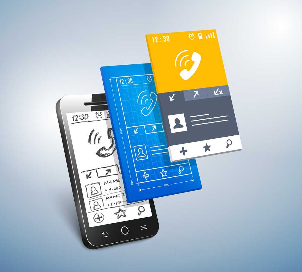
How do you design the UI for a new app or feature? Good old fashioned pencil and paper? Photoshop or Sketch? Perhaps a wireframing tool like Balsamiq? Maybe you build clickable mockups or fully interactive prototypes? However you go about it, using prototyping tools to get some feedback on a design before it’s fully coded is a great way to save time and effort.

When building an app for a client, they’re usually a lot happier if they can see and touch what they’ll be getting before it’s built. For your own apps, being able to rapidly iterate on the design with prototypes can get you to market with a quality product much faster. There’s been a lot of activity in the prototyping tools space over the last year or two, providing a variety of ways to build brilliant prototypes. In this post we’ll look at some of the most interesting and promising ones.
Animation era
In iOS 7 Apple made a major change to their UI design. The old realistic textures and skeuomorphic design elements were out and flatter, cleaner look was in. Many of the hints at what interface elements were for, or affordances in designer-speak, are now gone – replaced by animations that make it clear what’s happening as you start to interact with the interface. This arguably makes it harder for complete beginners to discover functionality but also makes it easier to understand what’s happening and how apps work. Well designed animations can delight and surprise, making the whole experience more engaging. The danger here is that developers building custom UIs in a similar style can mimic the look of the new UI without adding the animations. This effectively takes away almost everything that helps a user learn how to interact with the app. [tweetable]Animation became essential to a good UI design[/tweetable]. At the time there were almost no tools for designers to help them create or communicate this aspect of the user experience – developers largely had to add these animations in code and tweak parameters across many slow and painful iterations to get them right.
In the Android 5.0 update last year, Google has also adopted a much more minimalist UI style – they’ve called it Material Design. Here also, animation is a core part of the user experience; this is made very explicit in their design guide. Fortunately we’re now in a much better place in terms of tooling to design and prototype these animations. Which tools you’ll want to use is likely to depend on your current process, what sort of app you’re building and what level of fidelity you want to achieve in the prototype.
Exploring ideas
If you primarily want to create a prototype to explore an app idea or communicate about one, then it’s hard to beat the efficiency of pencil sketch on paper. That’s fine for showing a basic app layout but what if you want to explore interactions. Prott lets you capture your sketches and turn them into interactive prototypes that are fully tappable, along with custom gestures and transition animations. The tool also has collaboration functionality built in.

For those who prefer to start sketching out their ideas in a digital form but want a low-cost and low-effort way to add some basic interaction and animation, Apple gave us a peek at part of their prototyping process in one of the talks at WWDC (video requires developer login and Safari). They use Keynote! Creating slides with the dimensions of a device screen and animating from one to the next (particularly the “Magic Move” animation) allows for a surprising amount of sophistication. Since there’s a Keynote app for iOS devices too, you can actually preview the designs on the device. The major restriction here is that you can’t tap different areas to cause different actions – tapping anywhere transitions to the next slide, so you have to prototype individual flows through the app rather than the whole thing.
If you’re only designing for iOS and only want to use standard UI elements and screen transitions, then a fun alternative for exploring new ideas on the go is AppCooker. This is an iPad app for designing iPhone and iPad apps. It’s necessarily limited compared to many desktop tools but still very capable. There’s no custom animation support here though and while you can import images, it’s not really suited to designing a custom UI.
High fidelity prototypes without code
The majority of designers have limited coding skills. Being able to create a basic page layout and style it with HTML and CSS is an excellent start but it doesn’t get you to a place where you can easily build screen transitions or custom animations. Professional animators have almost always had tools that didn’t require coding but there was nothing for app designers. Facebook started using Apple’s Quartz Composer, a motion graphics tool, for prototyping. They built a toolkit on top of it for prototyping apps and released it for free as Origami. This is a highly capable toolset but since it wasn’t originally built for for designing apps it’s somewhat complex and difficult to learn and use. Quartz Composer itself is also not very actively maintained or stable.
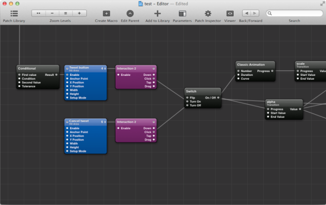
For anyone that wants a similar tool to Origami that’s easier to use there are a couple of excellent new options. If a complete freedom is what you want then Form is an excellent option. It was released by RelativeWave as a paid tool but then rapidly acquired by Google and made free. They initially launched for iOS only with plans announced to also support Android. With the tool in Google’s hands we can assume that Android support will come quickly. Like Origami, Form provides a node and graph based visual programming environment. They also have a viewer app so you can preview the design on as many devices as you like and it updates automatically as you make changes.

If you want to build prototypes that look and feel just like native apps using the built-in OS frameworks then Pixate is definitely worth checking out. It lets you build iOS and Android prototypes that use the native UI components directly. You can add your own custom styling and animations in a visual programming environment. The Pixate team are currently working on direct import functionality from Photoshop and Sketch, so it can be added seamlessly to existing static design workflows. They’re also planning to add native code export, so that when a design is complete, the native code generated for it can be used as the basis for the final app UI. Generated code doesn’t have a great history of being maintainable but if they can pull it off it would be a killer feature.
EDIT: Just after this was published, Pixate added a free tier that lets you use all of their features for 1 app.

HTML5-based solutions
There are lot of prototyping solutions on the market that involve building app UIs with HTML5. Some of them are for custom designs and others provide libraries of native component clones. Some do both but very few provide a good level of support for custom animation. A couple of interesting exceptions are Proto.io and Framer.
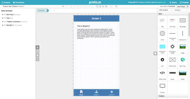
Proto.io is another non-coding solution which also has collaboration features, allowing you to get feedback from your team or a client. Unlike most of the tools on the market, it has a library of Windows Phone components as well as those for iOS and Android. You can test on real devices and export the final HTML5, which could be useful as the basis for a hybrid app, or just as a guide for the developers. It is a fairly expensive subscription solution compared to most of the others but would clearly produce an excellent impression in a consulting and contract development environment.
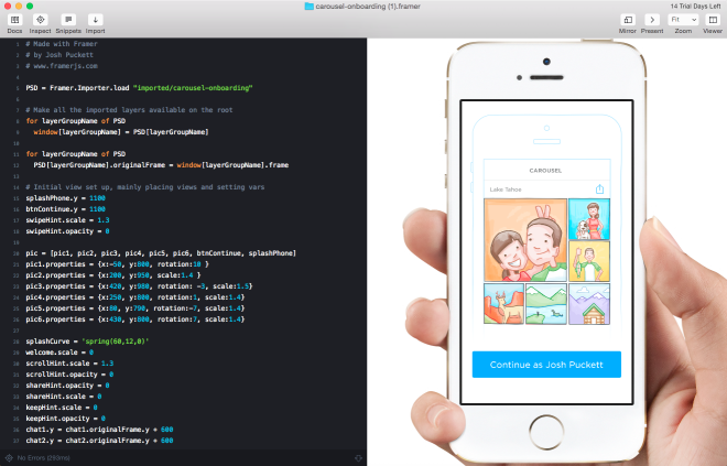
For designers that know their way around JavaScript (or CoffeeScript), developers with some design skills or those rare unicorns – true designer/developer hybrids – Framer is one of the most interesting options out there. Framer already has direct imports from Photoshop and Sketch and focuses on rapid iteration, including live device previews. If you do a lot of design work and iterating quickly is a key goal then Framer might be the tool to beat. The underlying prototyping framework, framer.js, is open source and could be used independently but a lot of the productivity boosting features are in the paid Framer Studio tool.
What about functional prototypes?
What if your prototype needs to do more than just look and feel like the final app? Some app concepts can only really be understood and tested with live data or working features like using the device camera. Depending on the level of complexity it may even be possible to prototype these too. One option would be to hook up the output of an HTML5 prototyping tool to some real device functionality in a hybrid app. Another option is to build a fully functional prototype in a rapid application development tool like LiveCode. Although there may be areas where performance or functionality are lacking compared to building a native app, LiveCode has a visual UI design environment and good animation capabilities. It also makes it very quick and easy to add a database of real data or mobile specific features. When you get to this level of prototyping complexity, it starts to get time consuming and costly to build the prototype. It may make sense to only prototype parts of an application in this way, where it’s critical to get the design right before a very lengthy and expensive coding phase.
Consider prototyping your next app in more detail
[tweetable]The most common problem in software projects is not the technical execution[/tweetable], although that often takes longer than expected. By far the most common reason for app projects to fail is building the wrong thing. Although on the surface building a prototype only to throw it away might seem like wasted effort, it can massively reduce the risk of much more effort going to waste building something either the client doesn’t want or insufficient customers are willing to pay for. Prototyping the UI and putting it in the hands of clients or potential customers in a real device is one of the best possible ways of getting concrete, actionable feedback. Pick one of these tools, or find another that suits you better and give it a try with your next app. If you’re already a prototyping convert and we haven’t listed your favourite tool here then let us know in the comments.
Recent Posts

August 27, 2025
How to Find the Right Learning Path When You’re Switching to a Tech Career
See post
August 27, 2025
The Hidden Challenges in Software Development Projects: Key Insights from Our Latest Survey
See post

August 22, 2025
Developer News This Week: AI Speed Trap, GitHub Copilot Agents, iOS 26 Beta Updates & More (Aug 22, 2025)
See post